Wireframe Tiles
Lay out responsive wireframes for everything from blogs and landing pages to apps and dashboards using flexible tiles.
Building blocks for your ideas
I loved playing with blocks as a kid. (In fact, I still do.) Even with a limited set of basic components, it felt like I could build almost anything. I think that’s why I love patterns and design systems just as much. By distilling each component to its essence and finding ways to make it flexible and reusable, it feels like those powerfully simple blocks all over again.
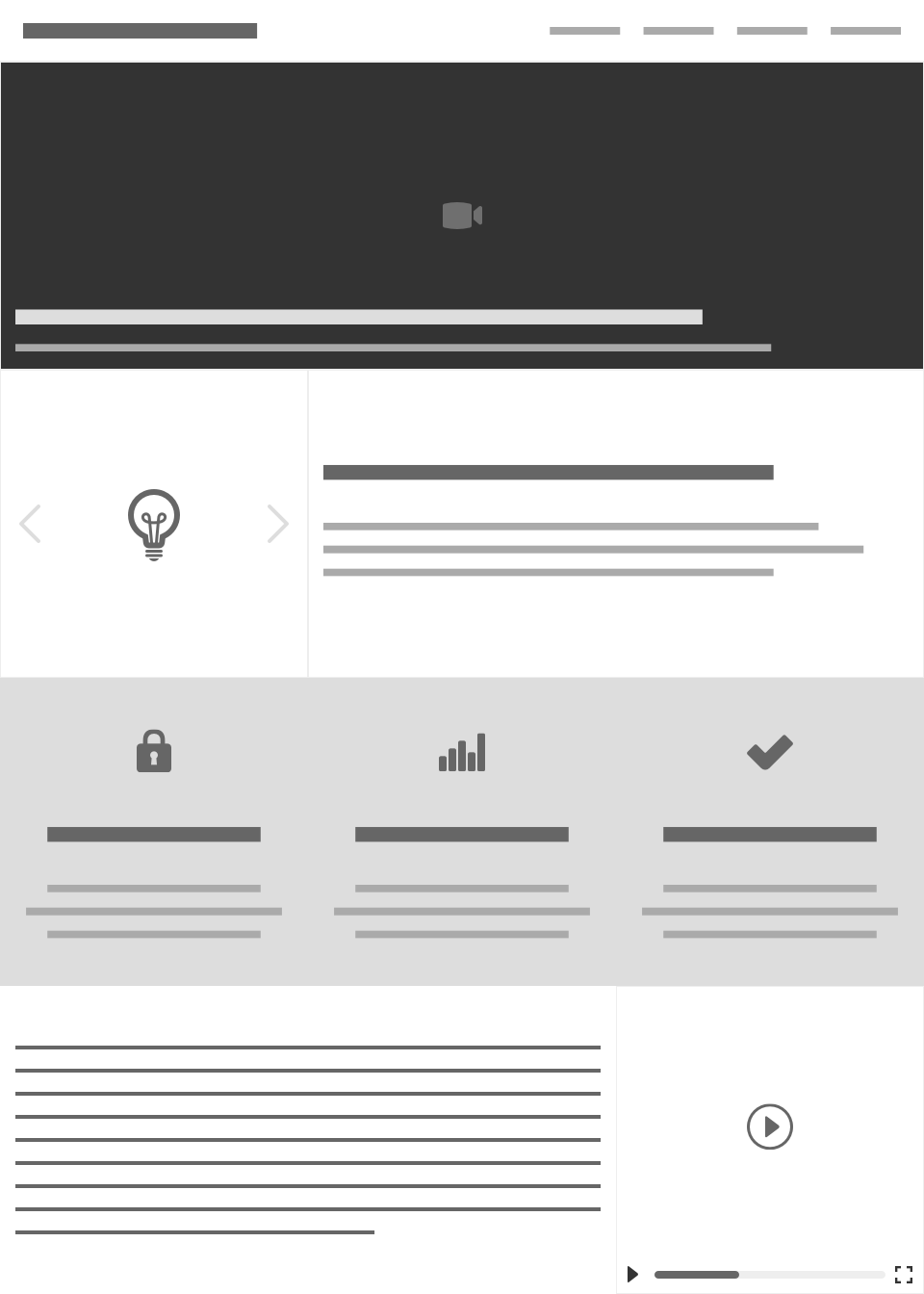
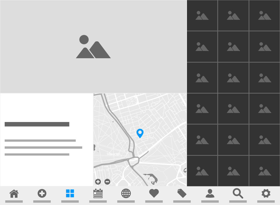
I built the Wireframe Tiles library as a reusable, responsive, and flexible set of interchangeable blocks that you can use to quickly mock up almost any concept, from basic content sites up to complex, interactive apps. These tiles aren’t meant to replace your final design, but they’re a great way to start the conversation about what’s important and where it belongs.
Tiles of all kinds
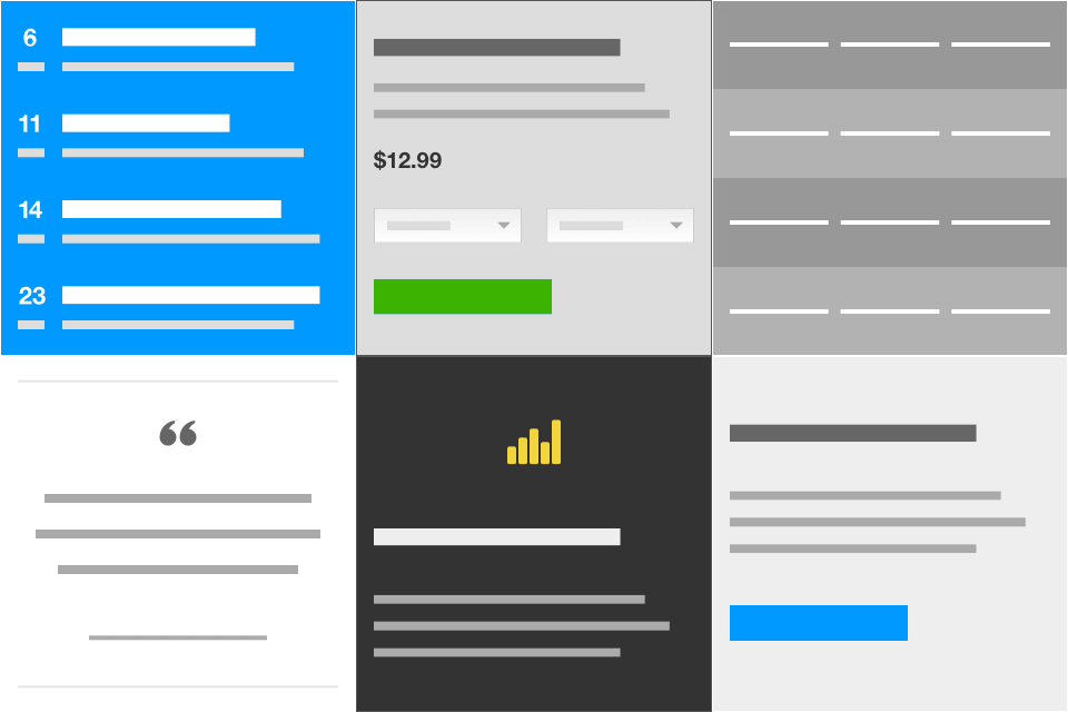
Content
From text and tables to events and ecommerce
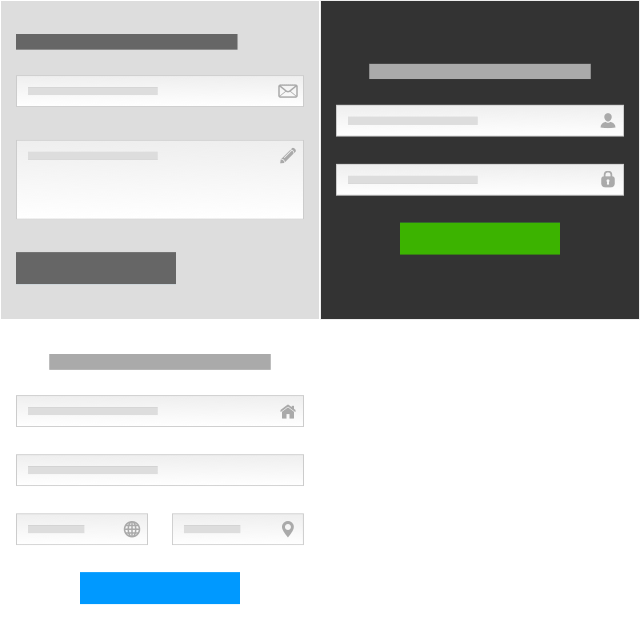
Forms
For logging in, sending messages, and more

Media
From audio and video to all kinds of images
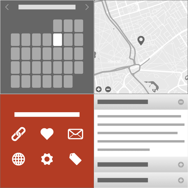
Widgets
To capture various interactive components
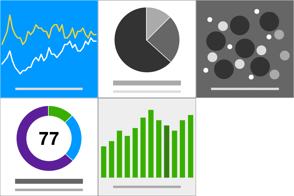
Data
For charts, graphs, numbers, and more

Social
From profiles and comments to feeds and chat
Featuring …
Through the magic of Sketch symbols
Responsive by design
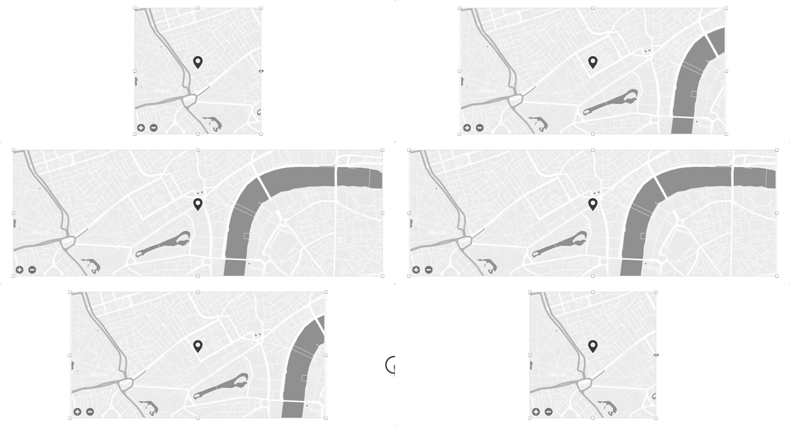
Each tile is painstakingly designed using Sketch’s built-in smart resizing tools so that it can be scaled from 320 pixels wide to as wide as you like. Individual elements are positioned and sized appropriately to fit the right context.
Flexible by nature
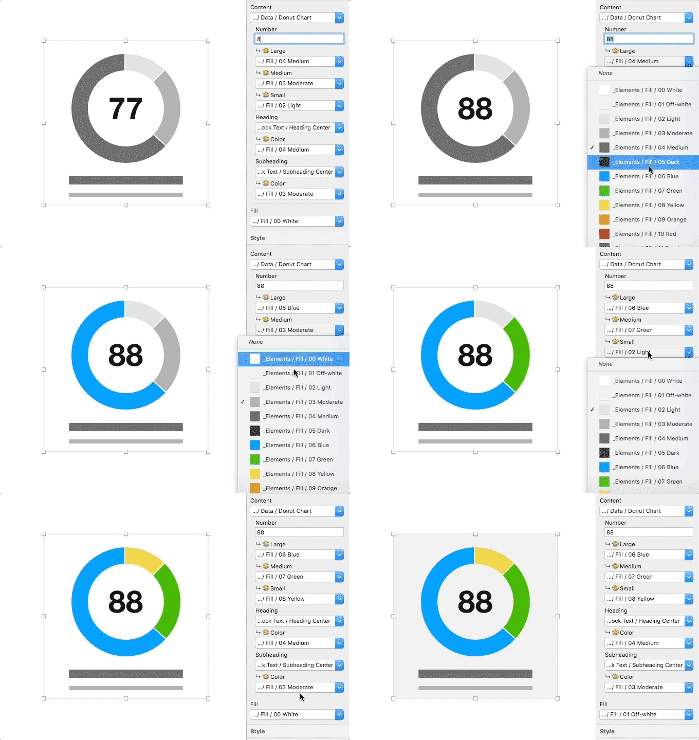
The tiles make use of Sketch’s symbol overrides to allow deep customization. You can change colors for individual elements, change border colors and backgrounds for the tile, choose alignment on text placeholders, and even swap between icons. This flexibility makes even the simplest tiles powerfully reusable.
See it in action

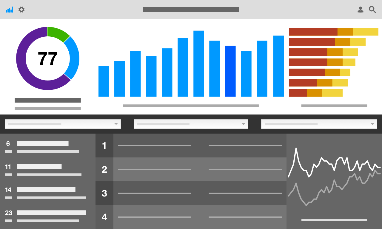
Like what you see?
There’s more where that came from. Lots more! The UX Compendium is a cohesive collection of useful templates and libraries for Sketch to round out your design process beyond the UI.
Explore the rest
-

Persona Cards
-
Scenario Comics
-
Sketching Templates
-
Style Tiles
-
Wireframe Tiles
-
Flows & Notes