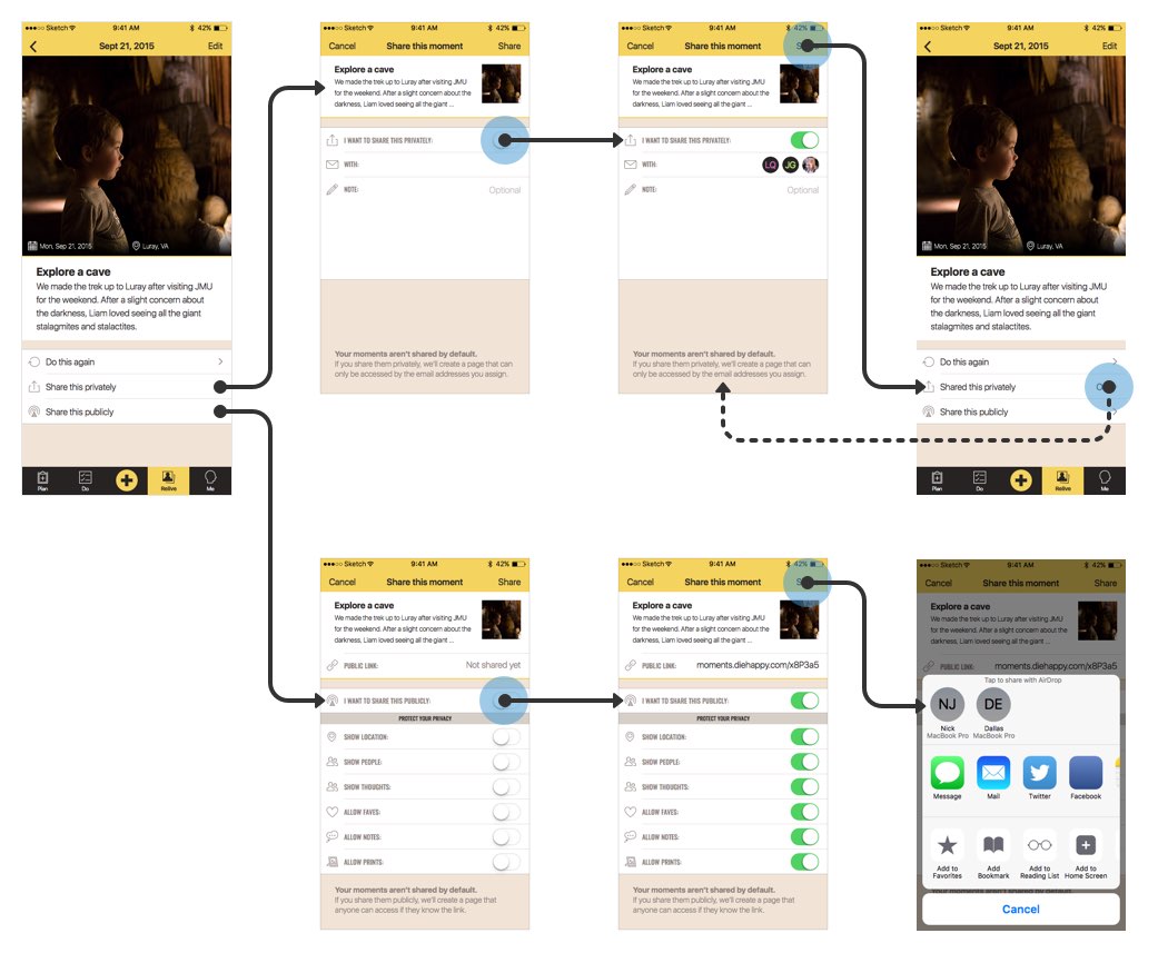
Flows & Notes

Connect screens with user flow lines, add notes on specific page elements, and show gestures, touchpoints, logic, and more.

Getting to clarity

When we design interfaces, there’s so much that static mockups don’t convey. How does this screen connect to that screen? How can the user interact with this element? Is there animation? What about hidden elements?

With Flows & Notes, you can quickly add notes on interaction, connect screens, logic, and more with flow lines, and add all the context your team needs to get better clarity on the work you’ve designed.

The right tools for the job
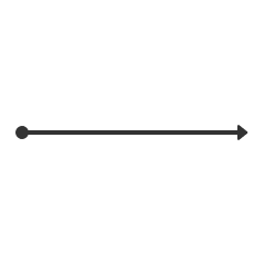
Animation: A repeating cycle of various types of lines going different directions and showing different icons at each end like a circle, square, arrow, diamond, and X.
Lines

Show connections, point out details, or denote flows

Animation: Another repeating cycle of various types of lines, this time dashed.
Dashed Lines

Capture optional routes or show secondary actions
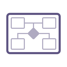
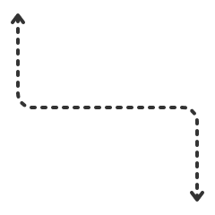
Animation: A repeating loop of different logic nodes like terminal (rounded rectangle), process (rectangle), decision (diamond), input (parallelogram), and label (shorter rounded rectangle) and depicting various states.
Logic

Use multiple nodes in different states to explain logic
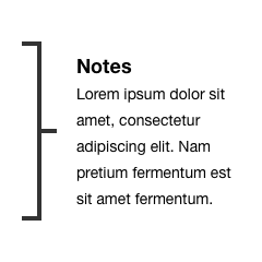
Animation: A short loop of note brackets pointing different directions with a placeholder note (in greek text) in a few styles: straight, curved, and angled.
Note Brackets

Add supplemental notes alongside mockups

Animation: A repeating series of icons for interactive gestures showing: one-finger tap, two-finger swipe left, three-finger swipe right, pinch, and zoom.
Gestures

Show how users interact with various elements

Animation: A looping preview of object icons commonly used in flowcharts like photos, servers, computers, documents, and browser windows.
Objects

Attach different touchpoints and devices to flows

Catch them in action

A mockup of the user flow for sharing a photo and story in a mobile app both publicly and privately. There are transparent blue circles over the primary action on each screen with a line extending to the relevant data on the subsequent screen.
A mockup of notes added to an individual mobile app screen. To the left of the app are individual numbered notes that correspond to numbered dots above the screen. To the right are sections denote what interactions are possible in each portion of the app along with graphical icons showing those actions.
A mockup of the site map for the UXcellence site. There are 3 major sections: Articles, Library, and Products, with subsections like Topics, Tags, and (in the case of Library) Publisher. There are also individual pages under each section as well as individual pages for Subscribe and Contact. Sections are noted with a folder icon and pages by a document icon.
A mockup of the general flowchart for using a typical social media photo sharing app, with branches for creating a new account, browsing a stream, viewing a profile, and sharing a new photo.

Like what you see?

There’s more where that came from. Lots more! The UX Compendium is a cohesive collection of useful templates and libraries for Sketch to round out your design process beyond the UI.

Buy it soon Learn more

Explore the rest